Author: lynseyfeilden

  • Nothing stays still, everything moves

    Nothing stays still, everything moves

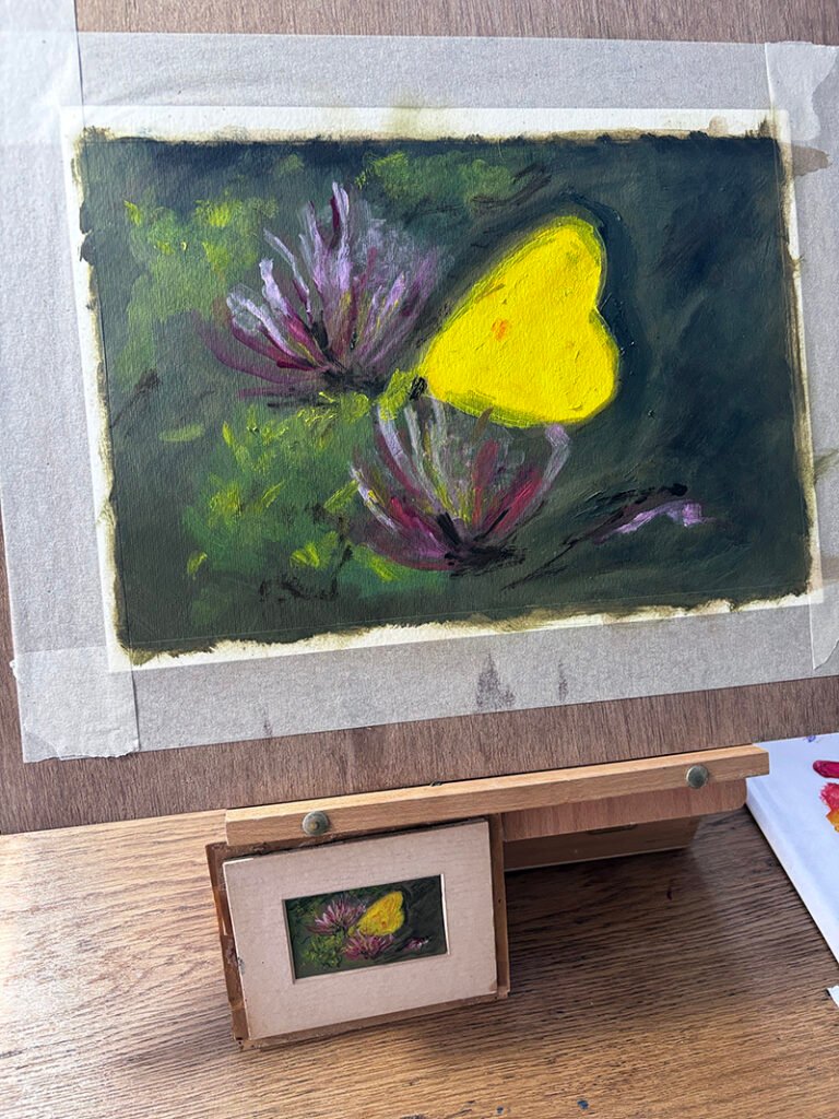
    This week I’ve made some progress on the Butterfly No.1 painting, and something quite odd happened as I painted its wings that threw me into thinking about it for a week.

    The Wings

    I’d been painting the butterfly’s wings with short strokes without thinking, I didn’t plan that at all. I only noticed it when I stood back from the canvas and saw what my hand had actually been doing while I wasn’t thinking about it. A butterfly’s wings are never properly still even when it’s resting on a flower or a piece of grass because they carry on moving slowly in and out and somehow my brush had picked up on that before I had.

    It started happening across the whole painting after that, not just the wings. I couldn’t bring myself to paint long strokes or anything but this kind of pitter patter brushstrokes. The only answer I keep landing on is that nothing is actually still and somehow these small brushstrokes were my way of trying to capture this.

    The Walk

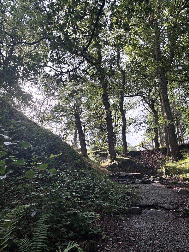
    I needed to stretch my legs after sitting for a few hours painting so I took the dog out and started looking properly at everything around me the way you do when a thought won’t leave you alone. A leaf with no wind on it isn’t still either if you watch it long enough. I filmed a bit of the walk so I’d have something to look back at while I paint. I’ve attached the video below, nothing in it is still, not the water, the path, the sky or the wind. Even standing at my easel thinking I’m holding perfectly steady I’m not because my heart is beating and that pulse is carrying through my hand into the brush whether I want it to or not.
    Movement of Thought

    It’s not just physical. Thoughts are never still. We’re always moving through them backwards and forwards in a way we can’t do anywhere else in life. In my head I can go back to a memory whenever I like. In real life I can only go forward and there’s no pause button for that. Movement is time and time only moves one way. All that’s left behind afterwards is memory.

    How Other Artists Have Shown it.

    I started thinking about how other artists have tried to catch movement in something that by its nature doesn’t move at all. Oil paint sits still on a canvas the same as a photograph does so the question is how you make something still feel like it hasn’t stopped.

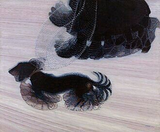
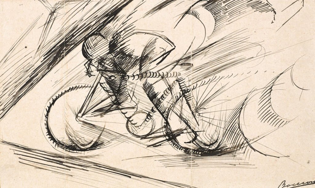
    Doing a bit of research I found that The Futurists spent a lot of time on exactly this. Giacomo Balla painted a dog on a leash with its legs multiplied and overlapping so you see the whole stride of it rather than one frozen step, the same way my strokes built movement into the wing of the butterfly. Umberto Boccioni went about it differently. I was looking at a sketch of his of a cyclist leaning into a bend and the movement there comes from outside the figure with diagonal lines cutting across the background as if the air itself is moving past him. It kind of reminded me of manga art, almost like speed lines. I guess it’s the same idea drawn a hundred years earlier in ink instead of print.
    Borrowing From Elsewhere

    Then I started thinking about borrowing techniques from other places. I came from design before I came properly to oils and design has never sat still inside one discipline. I went back to look at manga and the way movement gets drawn there is so confident with lines placed outside the figure telling you plainly that something has moved fast. It’s a different language to painting but it’s still working on the same problem I was working on with the butterfly which is how you make a still thing feel like it’s moving.

    I think there are two ways into this really. One is what Balla did and what I did without realising it which is movement built into the object itself into the actual brushstroke so you feel it rather than read it. The other is what Boccioni did and what manga does which is marks placed around the form telling you that it moved. I don’t think either one is more honest than the other. They’re just different tools and there’s nothing stopping an oil painter reaching for one that started out somewhere else entirely.

    Back to the Movement of the butterfly painting

    As I keep painting into the butterfly the sense of movement is going to matter as much as the scene itself and I think it might matter more. The movement will be in the paint itself in the actual gestures of the strokes building up across the canvas.

    The sense of movement reminds us that time only goes forward, it is always moving forward. It cannot be paused. “Movement is time and time only moves one way. All that’s left behind afterwards is memory.”

    Until next time.
  • Progress of The Butterfly

    Progress of The Butterfly

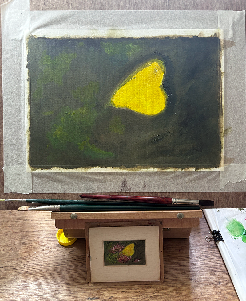
    Values are about correct with what has been painted so far. Next step will be adding in the honeysuckle and detail in the winds. This will be titled Butterfly No.1.

    One week since my last post I have been adding to the butterfly picture every day. I now understand the reason why oil painters have so many pictures on the go at the same time. Oil painting is a process of addition and sometimes subtraction, but all in all it is the process of building up a picture. Those layers take time to dry. Rush it and it turns to mud, but that’s where the beauty lies. It’s a slow and contemplative process, of looking and painting, looking again and repainting, looking and reflecting.

    I decided the background had become too dark so I added layers of grey to get the values correct. I have moved onto the wings and the bright greens and yellow that form the highs.

    Fat over lean Understood!

    I’m particularly enjoying the blending of the dark areas, and especially the way the lightened areas of the dark look. It was a mistake making those areas so dark in the first place but the quality, the kind of multi-faceted dark, is quite reflective of the original. I’ve eased off the turps a bit now because it was starting to look a bit flat and matte, so the fat over lean principle is definitely in place and I understand the technique.

    There’s a sense of movement already to the image, both of the wings of the butterfly and the areas around. This has a lot to do with my brushstroke I think. Not applying the paint in large strokes, but small, almost elliptical marks. It reminds me of the artist Y.Z. Kami that I mentioned in my previous post. It can be read here https://timeconsumed.com/the-ebay-purchased-painting-and-its-copy/

    His Domes series has a sense of movement, very delicate and ethereal. This is his Domes series on the link here;

    https://gagosian.com/exhibitions/2025/yz-kami-the-domes

    Painting as meditation

    The quite strange thing I have noticed so far when I have my daily moments of painting is that everything else goes quiet. My head, the noise outside. It is quite meditative and the sense of doing a little bit every day of something I love is quite humbling.

    I would say about fifty percent there with Butterfly No.1. I say number one as I think this could become a series, or a body of work. Many people look at butterflies for their beauty. I do too, but I like the idea of a butterfly more. The fleeting moment that I keep coming back to. The delicacy and mysteriousness of them. I know Damien Hirst did a series of butterfly art, but it wasn’t for me. To me it looked like trophy hunting. A wall of butterflies, almost like a wall of stag heads. I wonder if there is a meaning behind his series?

    This feels like the start of a body of work rather than a single painting. Butterfly no.1, with no.2 already waiting behind it.

  • The Ebay purchased painting and it’s copy.

    The Ebay purchased painting and it’s copy.

    If you have been following along here, you will know by now that my real passion is not so much finishing paintings as learning colour. Mixing it, getting it wrong, and slowly working out why. This post is really just three more installments of that same education: one from the easel, one from YouTube, and one from a podcast.

    A small painting

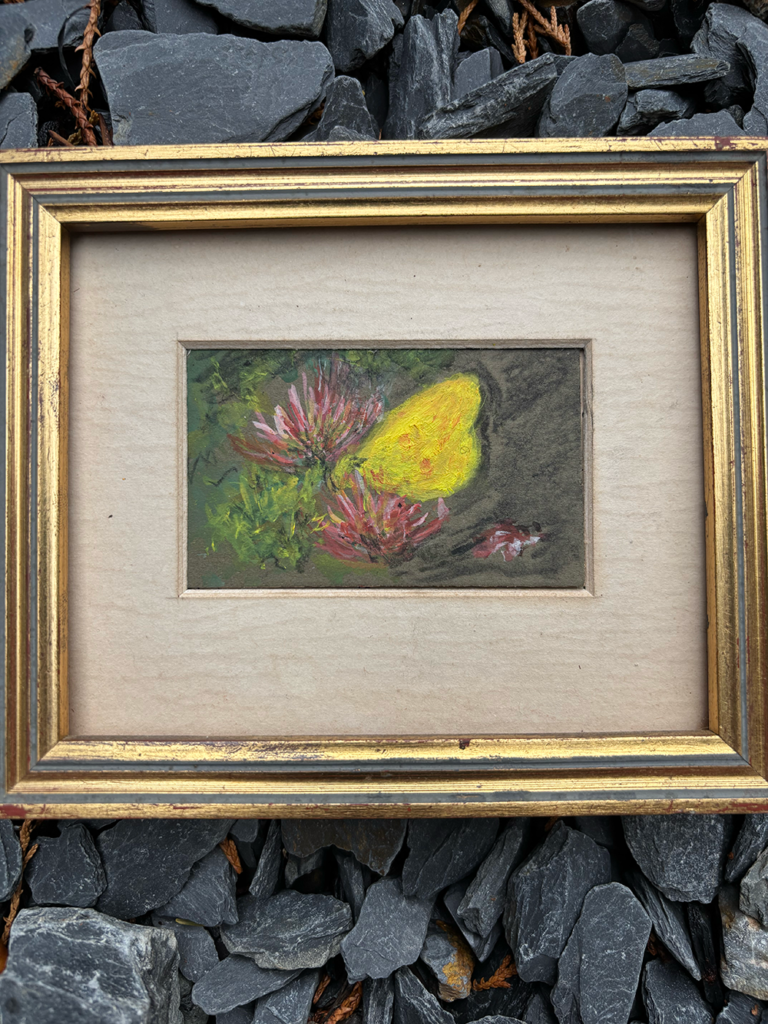
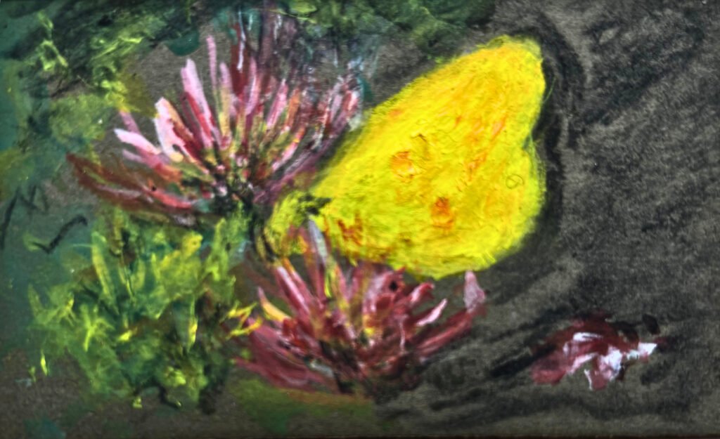
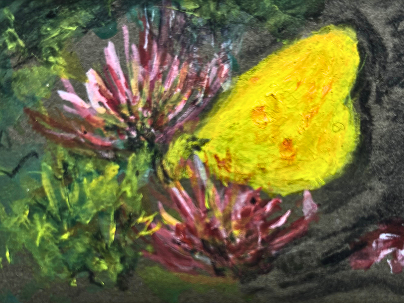
    About ten years ago I bought a tiny oil painting on eBay, a yellow butterfly resting on honeysuckle, only 8cm wide by 5cm. Up close you can see exactly what it is built from: loose, confident strokes that don’t pretend to be anything more than paint. Step back, and it resolves itself instantly into a butterfly catching the light on a honeysuckle flower. I think that gap, between what it is close up and what it becomes at a distance, is exactly why I love it. It is clearly the work of someone who knew what they were doing. The highs and lows sit balanced, and there is a sense of movement in the brushwork, as though the paint itself is still fluttering.

    The Butterfly in it’s original frame. Signed on the back by B.Thorburn 86

    As an exercise, I set myself the task of copying it, but three times the size. Working larger changes everything, of course. Marks that read as instinctive at 8cm have to be rebuilt thoughtfully at 24cm. Really though, the process is just looking and copying. Looking hard at where the butterfly sits and how much space breathes around it, then copying that placement into its new, larger world, leaving proper room for the two large honeysuckle flowers rather than letting them crowd in.

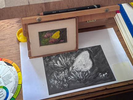
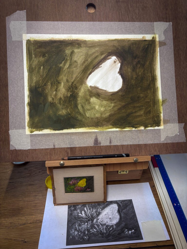
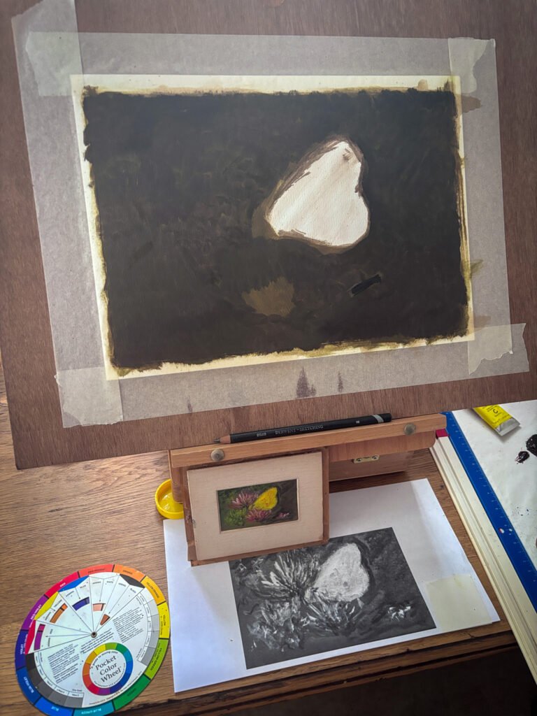
    I took a photograph of the original and turned it to greyscale, which made the values, the lights and darks, far easier to read than they are in colour. I propped both the original and that greyscale print up next to the easel, along with a little pocket colour wheel, so I could keep checking back against them rather than trusting my memory. Then I mixed a raw umber wash, keeping the fat over lean principle in mind so nothing thicker went down before the thinner layers, and started blocking in those values, leaving the butterfly itself as bare, untouched paper while the background went in dark around it.

    First colour layer. The butterfly is left as bare paper while a warm, olive-green wash goes in around it, values before anything else.
    First colour layer. The butterfly is left as bare paper while a warm, olive-green wash goes in around it, values before anything else.

    The surface drank up the paint quickly, which let me move through the first washes faster than I expected, a slightly grey, muted green for the background. The ground itself looked warm to me, so I built it from warm-leaning primaries, cadmium yellow, cadmium red, and ultramarine blue, mixing until I had something close to right, then knocking the saturation back with a touch of titanium white. I thinned that mix with a little thinner and liquin and laid it down in one pass, then went back over it with a second, slightly darker layer once the first had settled.

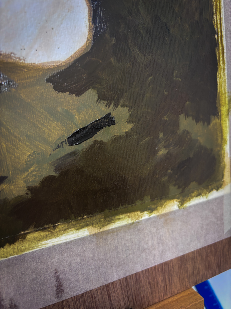
    A close-up of that second layer while still wet, thick, textured strokes of dark olive and brown, with liquin catching the light where the paint is thickest.

    I started with the values, blocking everything in with raw umber first and building up the dark areas, while leaving the lightest values of the yellow wings completely untouched. I’m getting into the habit, and the penny is dropping, that I ought to get my values and structure sorted before a scrap of colour goes anywhere near the canvas. It is proving just as useful copying someone else’s painting as it is working from life.

    Third layer. The background has darkened further, closer now to the near-black of the original, with the butterfly shape still held back, waiting for its colour.

    As I worked on the replica, it reminded me of a book I have called Van Gogh Repetitions, by Eliza Rathbone and William H. Robinson. It looks at the many different paintings Van Gogh made of the same subject, each in different values and different families of colour and saturation, what he himself called his “repetitions” rather than copies. What I find interesting is that a painting can still work perfectly well even when the colours aren’t realistic, so long as the values are right. You can paint a subject almost any colour you like, provided the tonal structure holds it together.

    A closer look

    There is real movement in this little painting, a lightness in the honeysuckle flowers and a lightness in the handling itself, nothing overworked. I have read that butterflies are often taken to mean renewal, and I keep wondering whether that dark, muted background against the cool, bright butterfly is doing exactly that for me, whether without meaning to I have been drawn to a small piece of symbolism about coming out of darkness. Which, without wanting to sound too grand about an 8cm painting bought on eBay, is not far off the title of Tracey Emin’s recent Margate show, Crossing Into Darkness, which takes darkness as a threshold you pass through toward renewal rather than something to fear. I doubt the original painter was thinking anything of the sort. I doubt I was either, until I sat with it long enough to wonder.

    Detailed shot of The Butterfly

    I also find myself imagining what else might be in the picture if it were painted larger, whether this butterfly is resting on honeysuckle at the edge of a motorway with lorries thundering past just out of frame, or deep in a forest where nobody will ever see it at all. The painting gives you none of that context, which is rather the point. It hands you a moment and lets you decide what surrounds it.

    What I have been listening to

    I am spending more and more time with art documentaries and podcasts lately. My favourite this week was a Louisiana Channel film on the artist Y.Z. Kami. He shares my fondness for the smell of oil paint, which I found strangely comforting to hear, but it was his way of working that stayed with me. The portraits, and those strange circular canvases that seem to draw you in until they disappear into something close to oblivion.

    I also went back to an episode of Talk Art with Tracey Emin from a few months back. I particularly like the way Dame Emin talks about her own work.

    In fact, I think the artists I return to most often are the ones who are generous about sharing their thinking: their process, their failures, and what actually makes them want to paint in the first place.

    I think showing art is only half the story and perhaps my love of art is also just as weighted to the story behind the piece and about the artist. I could listen to Tracey Emin talk for hours.

    Keeping track of it all

    I am tempted to start building a proper list here on the blog: books, talks, YouTube channels, podcasts, a small library of the things that have taught me something. I already keep a version of this privately in Obsidian, a free note-taking app and, so far, a brilliant place to gather notes, half-formed ideas, and the odd stray thought before I forget it. It syncs across my iPhone and my Mac too, so I can jot something down at two in the morning and pick it up again properly the next day at the desk.

    Thank you for reading. Back to the butterfly next.

  • Starting with learning how primary colours work

    Starting with learning how primary colours work

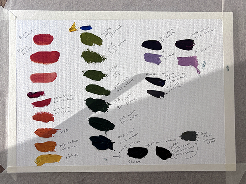
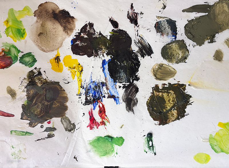
    I have always known, in the way you know a fact without really knowing it, that you can make almost anything from red, yellow and blue. It is one of those things you are told quite early on in school art class but didn’t really understand it or never really practiced the art of mixing primaries. So today I did. I taped a sheet of oil paper to the table, squeezed out a cadmium yellow, a cadmium red, and a cobalt blue, and gave myself an afternoon to see what they were really capable of.

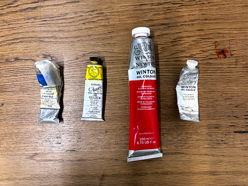
    The three tubes, well 4 including the Titanium White. The Michael Harding Cobalt Blue, Rowney Cadmium Yellow series E and Winsor and Newton Titanium White series 1 are rather old, bought when I first started learning about oil painting. The larger Winsor and Newton Alizarin Crimson is a recent buy to complete the three primary…

    The exercise

    The first column was straightforward enough. Crimson into cadmium, in different measures, walking from a deep pink through to orange and on to a colour that was practically a warm gold by the time white joined in. I could see the whole thing coming and mostly it behaved. But the moment I moved on to greens I understood why so many painted landscapes end up looking a bit municipal. Cadmium and cobalt on their own gave me something closer to khaki than any leaf I have ever stood under, and it took several goes, nudging the ratio one way and then the other, before I found a green with any life in it. Sixty percent cobalt to forty cadmium, roughly, was where it started to sing. Any more yellow and it went sickly. Any more blue and it went flat.

    The surprise of black

    The real surprise was the last column. I had always reached for a tube of black without giving it much thought, the way you reach for salt without measuring it. But mixing my own, from cobalt, crimson and a touch of cadmium, gave me something with far more depth than anything from a tube. There was a purple lurking in there, and a bottle green, and once I added white it came out lilac rather than grey. A black that is actually made of colour behaves quite differently from a black that is simply black, and it was only by mixing it myself, badly at first, that I understood why.

    Why this matters

    I know this is exactly the kind of exercise every painting book tells you to do in the first chapter, and I have skimmed past that chapter more than once over the years, always keen to get on with something that looked more like a painting. What I am learning, rather later than I would like, is that this is the painting. Or at least it is the part that everything else depends on. You cannot really see what you are doing with colour until you have stood in front of a palette and made the mistakes for yourself, watched a green go muddy and had to work out why, rather than simply reading that it might.

    I mentioned in my first post here that colour is relational, that a yellow changes depending on what sits beside it. Today’s exercise has given me the raw material to actually test that properly, now that I have a small library of mixes with notes on how I got there, rather than just a feeling I am chasing from memory each time.

    While I had paint on my hands I had the Louisiana Channel’s interview with David Hockney playing in the background, one of the last videos he did before passing away a few weeks ago. He makes the point that everything drawn or painted is an abstraction, however faithful it looks, because you are always translating a three-dimensional, moving, coloured world onto a flat surface using marks that are never quite the thing itself. I found that oddly reassuring while looking at nine little smears of paint that were meant to be a leaf. My green is not going to be the hedge outside my window. It was never going to be. It is my abstraction of it, built from three tubes of paint and an afternoon of getting it wrong, and that is rather the point of doing it by hand at all. He also talks in that same series about painting needing the hand, the eye and the heart together, and today felt like a fairly literal demonstration of that: the hand mixing, the eye judging, and a fair bit of heart required to keep going once the fourth green in a row still was not right. If you have half an hour, it is well worth watching in full: David Hockney interviewed by Louisiana Channel.

    Practical advice for beginners

    If you are starting out and colour feels like a mystery, as it did to me for a long time, my only real advice from today is this: buy three tubes, tape down a sheet of paper, and just mix. Write down your ratios as you go, because you will not remember them otherwise, and expect the first few to disappoint you. That disappointment is doing something useful. It is teaching you far more than a colour wheel ever could, and it is exactly where I said in my first post about learning to see colour that most of my real education has come from.

    Thank you for reading this one. I have a feeling I will be back at that palette again before the week is out.

  • Old Pages, Old Signs: Looking for Inspiration Off Pinterest

    Old Pages, Old Signs: Looking for Inspiration Off Pinterest

    I read a lot and I always have done and I think that reading these days has become rather more important than I realised it would be because it seems to be the one thing that stops my ideas from all looking rather the same as everyone else’s.

    You see it is tremendously easy nowadays to open Pinterest and type in whatever subject you happen to be working on and within a matter of moments you will have a hundred versions of precisely the same idea served back to you and it is all very efficient and practical but I have come to realise that it is rather a trap if I am being honest with you. When everyone is drawing from the same boards and the same trending searches and the same handful of accounts that everyone else is looking at then everything begins to look rather like everything else and that is not really what I want for my own work at all.

    So somewhere along the way I stopped starting there and instead I began going back to books and to the places where books live and second-hand bookstores especially have become rather special to me. There is something quite wonderful about a shop full of other people’s old paperbacks with their cracked spines and someone’s handwriting in the margins and perhaps a bus ticket used as a bookmark twenty years ago and Pinterest simply cannot give you that feeling at all. Nobody has already turned it into a mood board or filtered it through a thousand other people’s opinions. It is just sitting there waiting quietly to be noticed.

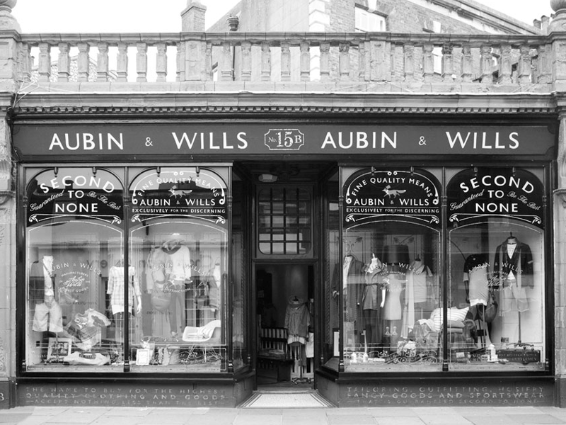
    I have also started to photograph old shop signs whenever I come across them and I find there is a whole history of craftsmanship sitting on the front of these buildings that nobody ever designed with a trend in mind. The hand-painted lettering and the slightly wonky kerning and the colours that have faded in a way that no filter could ever fake properly and quite often I do not even know what the shop used to sell but that does not really matter to me.

    This love of old things has taken me further into history generally and not just as a subject to know about but as an actual source of ideas and inspiration. Stories from decades or centuries ago and the way people dressed and wrote and the way they approached their problems without any of the tools we take for granted now and I find that far more interesting and far more honest than anything currently circulating on the internet.

    I do not think there is anything wrong with Pinterest if I am being fair but I have found that the more time I spend in second-hand bookshops and standing in front of old shop signs taking far too many photographs the more original my own work begins to feel and reading slows me down in much the same way. A good book does not hand you an idea all neatly formed and ready to use but rather it gives you a world to sit in for a while and I usually come out the other side of it with something I would not have found any other way at all.

    This is where I shall be sharing more of that and the books and the bookshops and the old signage and the bits of history that keep pulling at my attention. Thank you for reading this one.

  • Learning to See: What Painting Has Taught Me About Colour

    Learning to See: What Painting Has Taught Me About Colour

    I used to think I understood colour. I had studied art at college, at foundational level and also took a degree based design course. Entering the professional world my designs were never questioned for my use of colour so I thought I must of been ok. That was until one day when presenting a piece of work, a peer at the time absolutely bulldozed into me about my lack of understanding of colour. That day 15ish years ago hit hard and it still does. It’s not recently many years later that I have a bit of time to look at honing my use of colour.

    Staring at a screen for many years using colour screen is one thing. Colour mixed on a palette, responding to the light in a room, sitting next to another colour that changes how you perceive it – that’s something else entirely. My artwork has become the place where I’m slowly, sometimes frustratingly, learning to really see colour. This is where I see myself learning about colours.

    One of the biggest shifts has been learning that colour is relational. A yellow next to grey looks completely different from the same yellow next to purple. Value, how light or dark a colour is, often matters more than the hue itself. And temperature, whether a colour leans warm or cool, changes the whole mood of a piece before I’ve even settled on what I’m painting.

    I’ve also learned to slow down. Mixing the exact shade I’m after usually takes several attempts, and most of what I’ve learned has come from getting it wrong: a muddy mix, a colour that fights with everything around it, a painting that just doesn’t sit right until I figure out why. Each mistake has taught me something a colour wheel never could.

    The strange thing is, this has changed how I see the world outside the studio too. I notice the blue-grey of shadows on a wall, the way autumn light shifts everything warmer, colours I would have walked past a few years ago. That’s the part I didn’t expect: that learning to paint colour would change how I actually see.

    This blog will be where I share more of that process: the experiments, the mistakes, and what I’m learning along the way. Thanks for reading the first one.