If you have been following along here, you will know by now that my real passion is not so much finishing paintings as learning colour. Mixing it, getting it wrong, and slowly working out why. This post is really just three more installments of that same education: one from the easel, one from YouTube, and one from a podcast.
A small painting
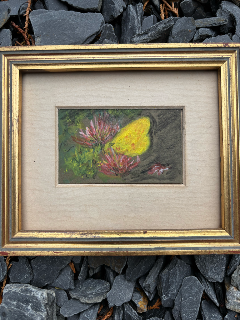
About ten years ago I bought a tiny oil painting on eBay, a yellow butterfly resting on honeysuckle, only 8cm wide by 5cm. Up close you can see exactly what it is built from: loose, confident strokes that don’t pretend to be anything more than paint. Step back, and it resolves itself instantly into a butterfly catching the light on a honeysuckle flower. I think that gap, between what it is close up and what it becomes at a distance, is exactly why I love it. It is clearly the work of someone who knew what they were doing. The highs and lows sit balanced, and there is a sense of movement in the brushwork, as though the paint itself is still fluttering.
As an exercise, I set myself the task of copying it, but three times the size. Working larger changes everything, of course. Marks that read as instinctive at 8cm have to be rebuilt thoughtfully at 24cm. Really though, the process is just looking and copying. Looking hard at where the butterfly sits and how much space breathes around it, then copying that placement into its new, larger world, leaving proper room for the two large honeysuckle flowers rather than letting them crowd in.
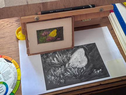
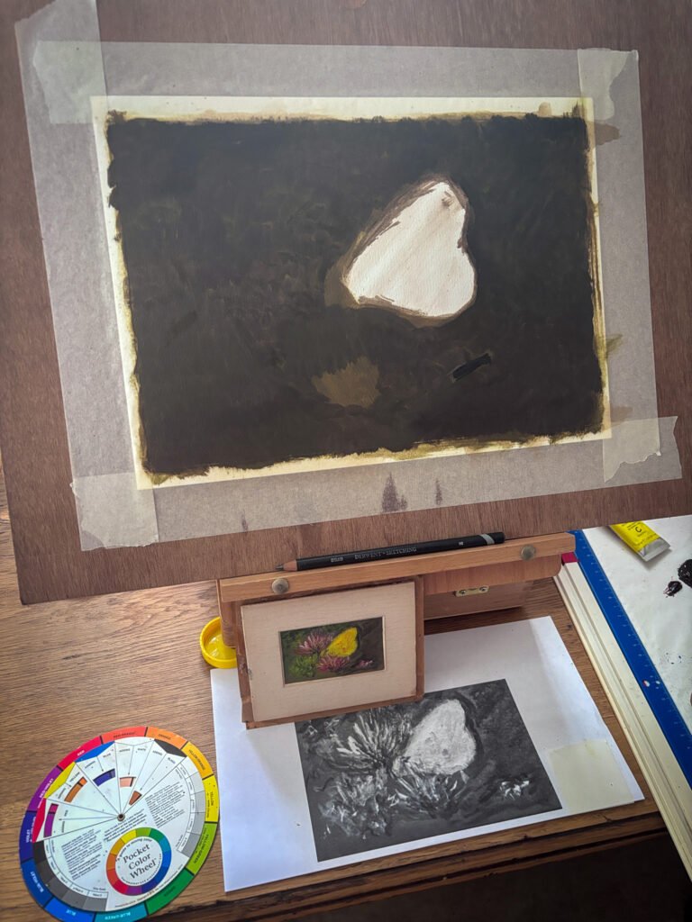
I took a photograph of the original and turned it to greyscale, which made the values, the lights and darks, far easier to read than they are in colour. I propped both the original and that greyscale print up next to the easel, along with a little pocket colour wheel, so I could keep checking back against them rather than trusting my memory. Then I mixed a raw umber wash, keeping the fat over lean principle in mind so nothing thicker went down before the thinner layers, and started blocking in those values, leaving the butterfly itself as bare, untouched paper while the background went in dark around it.
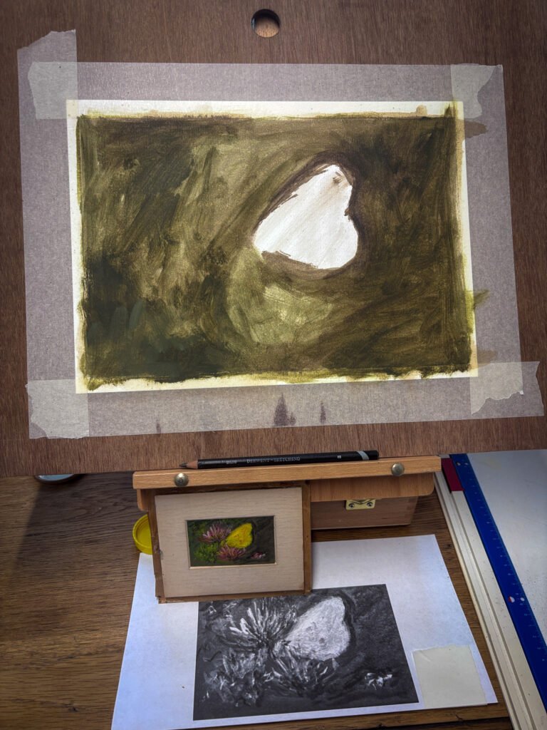
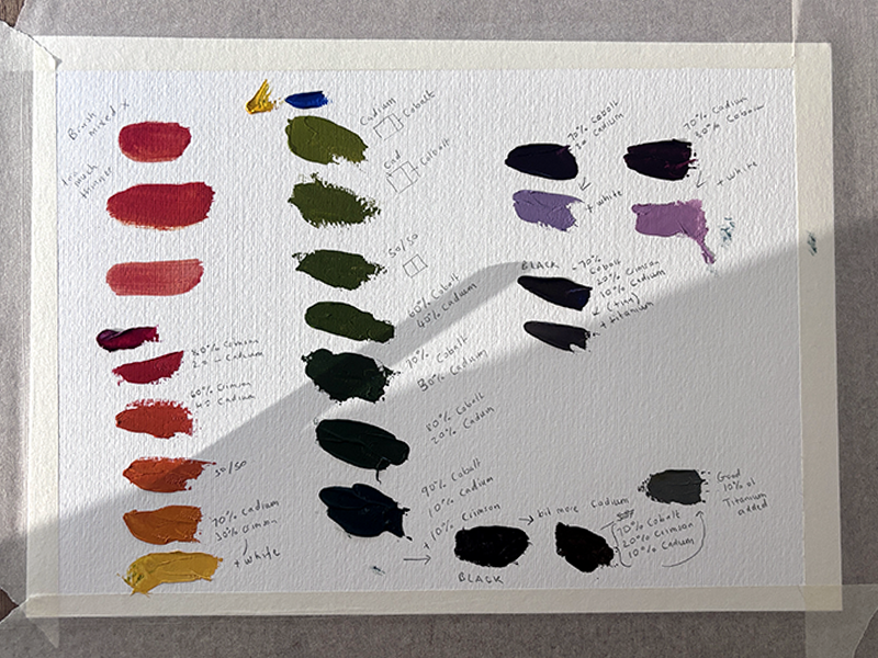
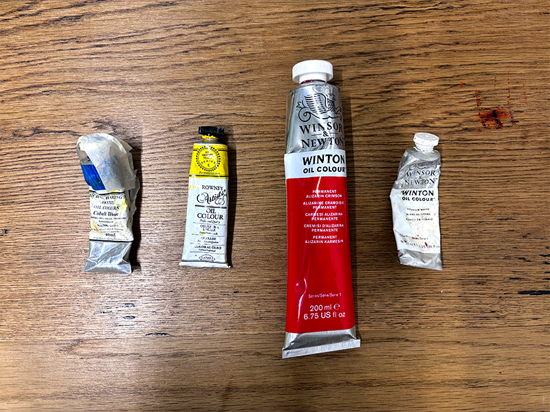
The surface drank up the paint quickly, which let me move through the first washes faster than I expected, a slightly grey, muted green for the background. The ground itself looked warm to me, so I built it from warm-leaning primaries, cadmium yellow, cadmium red, and ultramarine blue, mixing until I had something close to right, then knocking the saturation back with a touch of titanium white. I thinned that mix with a little thinner and liquin and laid it down in one pass, then went back over it with a second, slightly darker layer once the first had settled.
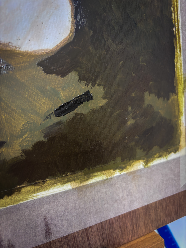
I started with the values, blocking everything in with raw umber first and building up the dark areas, while leaving the lightest values of the yellow wings completely untouched. I’m getting into the habit, and the penny is dropping, that I ought to get my values and structure sorted before a scrap of colour goes anywhere near the canvas. It is proving just as useful copying someone else’s painting as it is working from life.
As I worked on the replica, it reminded me of a book I have called Van Gogh Repetitions, by Eliza Rathbone and William H. Robinson. It looks at the many different paintings Van Gogh made of the same subject, each in different values and different families of colour and saturation, what he himself called his “repetitions” rather than copies. What I find interesting is that a painting can still work perfectly well even when the colours aren’t realistic, so long as the values are right. You can paint a subject almost any colour you like, provided the tonal structure holds it together.
A closer look
There is real movement in this little painting, a lightness in the honeysuckle flowers and a lightness in the handling itself, nothing overworked. I have read that butterflies are often taken to mean renewal, and I keep wondering whether that dark, muted background against the cool, bright butterfly is doing exactly that for me, whether without meaning to I have been drawn to a small piece of symbolism about coming out of darkness. Which, without wanting to sound too grand about an 8cm painting bought on eBay, is not far off the title of Tracey Emin’s recent Margate show, Crossing Into Darkness, which takes darkness as a threshold you pass through toward renewal rather than something to fear. I doubt the original painter was thinking anything of the sort. I doubt I was either, until I sat with it long enough to wonder.
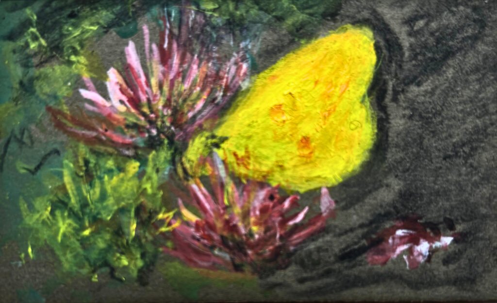
I also find myself imagining what else might be in the picture if it were painted larger, whether this butterfly is resting on honeysuckle at the edge of a motorway with lorries thundering past just out of frame, or deep in a forest where nobody will ever see it at all. The painting gives you none of that context, which is rather the point. It hands you a moment and lets you decide what surrounds it.
What I have been listening to
I am spending more and more time with art documentaries and podcasts lately. My favourite this week was a Louisiana Channel film on the artist Y.Z. Kami. He shares my fondness for the smell of oil paint, which I found strangely comforting to hear, but it was his way of working that stayed with me. The portraits, and those strange circular canvases that seem to draw you in until they disappear into something close to oblivion.
I also went back to an episode of Talk Art with Tracey Emin from a few months back. I particularly like the way Dame Emin talks about her own work.
In fact, I think the artists I return to most often are the ones who are generous about sharing their thinking: their process, their failures, and what actually makes them want to paint in the first place.
I think showing art is only half the story and perhaps my love of art is also just as weighted to the story behind the piece and about the artist. I could listen to Tracey Emin talk for hours.
Keeping track of it all
I am tempted to start building a proper list here on the blog: books, talks, YouTube channels, podcasts, a small library of the things that have taught me something. I already keep a version of this privately in Obsidian, a free note-taking app and, so far, a brilliant place to gather notes, half-formed ideas, and the odd stray thought before I forget it. It syncs across my iPhone and my Mac too, so I can jot something down at two in the morning and pick it up again properly the next day at the desk.
Thank you for reading. Back to the butterfly next.